COMPANY BACKGROUND
FlightSafety is a leading aviation training and services company. Founded in 1951, FlightSafety strives train customers to operate their aircraft to the highest level of safety. Building on that foundation, the company is dedicated to safety, its experienced instructors, training effectiveness, leading edge courseware, and advanced-technology simulators and products that provide unmatched realism to train aviation professionals. I was Manager of the User Experience Development from February 2016 to June 2019.
ROLE & RESPONSIBILITIES
As Manager of the UX Development team at FlightSafety and leveraging my prior website management experience, UX/UI Design and Programming skills, and experience, my my role was to lead our teams and company through the extensive website redesign process. FlightSafety.com had not been significantly redesigned in nearly fifteen years. This case study details my work leading the team to understand the situation; research and define the problem; concept, design, prototype and build solutions; communicate with our users, content creators, and executive staff; work with our design, engineering, and content teams to plan the site build, iterate and test with users; launch the new site; train content creators and staff to update and maintain the site; and finally to use site analytics and metrics to drive site improvements.
DEFINING THE PROBLEM
FlightSafety.com needed a complete website redesign to address content, layout, usability, and UI/UX issues and inconsistencies that had built up over time. Through our research and discovery led process, we collaborated with Greteman Group to focus upon solving these myriad problems, building a responsive mobile layout, enabling online course reservations, and building a clear and consistent Design System that could be applied to additional websites and products. Integrating our design, development, and QA processes was vital to launch our redesigned website and enable teammates to update and maintain the website post launch.
FORMER WEBSITE 2003-2018
FlightSafety.com had not been redesigned since 2003. In nearly fifteen years, the company had embarked upon discussions about redesigning the website, but could never prioritize nor complete a full website overhaul.


NEW WEBSITE
2018 – PRESENT
In Q4 of 2018, nearly fourteen months the project commenced, we launched the new FlightSafety.com.
THE DESIRED OUTCOME
First and foremost my immediate goals were to help lead FlightSafety through a comprehensive website redesign through a focused UX Design Process, along with designing and building a website that would effectively communicate the strength of our brand, products, services, aviation safety, and focus upon the customer. As Manager of the UX Development team, I also selfishly wanted our entire company to be proud of our brand identity as it had been nearly fifteen years since the last website redesign.
SCOPE
- UX Design & Research
- Product & UI Design
- Project & Resource Management
- Information Architecture
- Programming
- QA Testing
TASKS
- Conduct Research, Analysis, & Actionable Findings
- Create Project Plan, Timeline, & Roadmap
- Organize Assets & Develop Prototypes
- Present Findings to Executive Team
- Guide Internal Redesign Process
ACTION PLAN
- Discovery
- Competitive Analysis
- Mood Boards
- User Personas & User Stories
- Interaction Guide & Scenario Maps
- Content & Site Maps
- Sketching, Whiteboarding, & Wireframing
- Iteration & Testing
- Release
- Documentation
THE PROCESS & SOLUTION
Before FlightSafety.com could be launched, much less designed, I needed to start with UX Research to learn and document as much as possible about our users, visitors, and customers. Managing a two person UX team, I knew that our work and value would be most effective by convincing our executive team to commit the resources to redesigning and rebuilding our website. To earn their trust, I wanted to give the executive, marketing, and engineering teams a firm understanding of the design and development processes, scope, and extensive work entailed to deliver a completed website within our desired time frame.
DISCOVERY
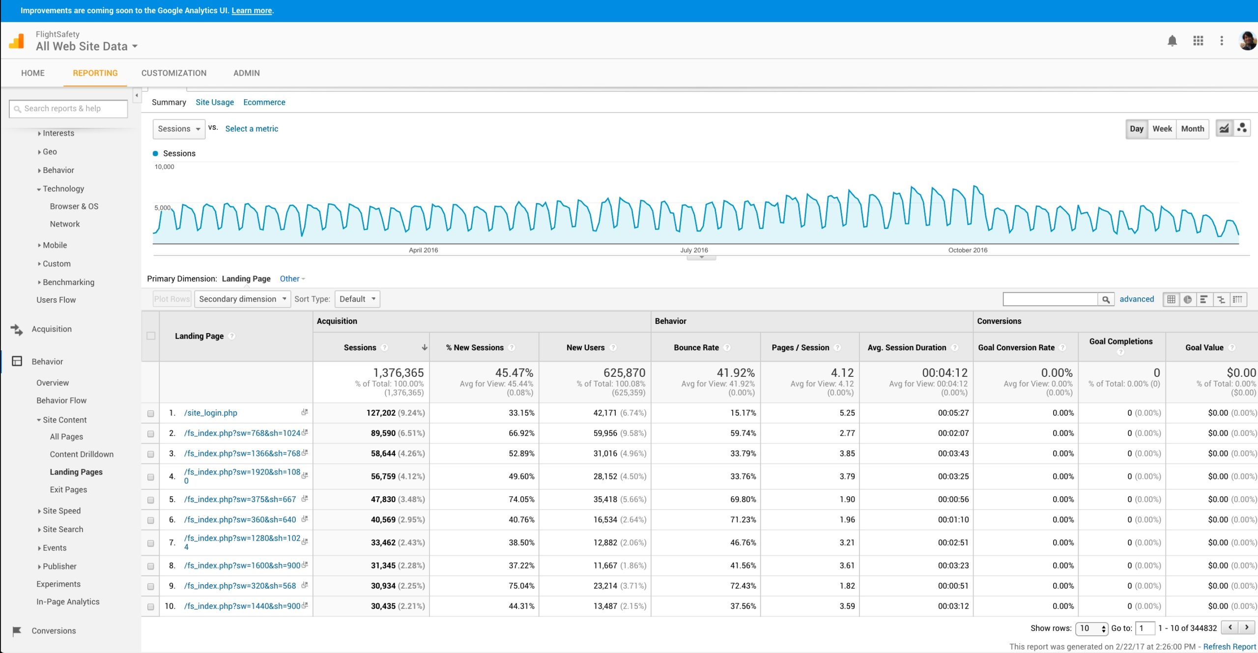
Embarking upon a Discovery process, my UXD team and I began with assessing the make up of our users. Who were they? What were they looking to find on our website? Were they successful? If not, why? Where was the process breaking down for them? What were their behaviors and actions telling us? What was the data telling us? How could we help? Gleaning what we could from our website analytics as a start, we began to learn and document everything we could about our internal and external users, how updates were being managed, and what functionality our collective users were asking from a new website.


SCRUM SPRINTS
I led our UX team through documenting a Competitive Analysis, Sitemaps, and defining User Personas, Stories and Interaction Guides based upon a thorough audit and analysis of all of our websites. As a largely distributed Agile Product Team, we ran two week focused Sprints, as part our Scrum implementation. Each day at standup, I led my team through our daily, weekly, and bi-weekly tasks. I kept daily notes of progress, paint points, issues, and solutions. At the end of each week, my reports would send me a summary of their progress for each of their Stories via Microsoft’s Team Foundation Server (TFS). As with any Scrum focused team, we measured our weekly and bi-weekly reviews. Tracking our own time and work during this phase was especially crucial.
TECHNICAL AUDIT
My team and I worked through a technical audit of our old website and detailed the myriad problems with the design, usability, and design patterns on our website. This audit was meant to display the many problems our website displayed along with how we could improve upon these deficiencies. Again it was important to establish the value, processes, and results from thoughtful UX Design and Research to our teammates and executives.
MOBILE FIRST
Along with our user interface, experience, and technical audits, it was important for my UX team and I to highlight the importance designing for mobile users first. Our user research and interviews helped us define their pain points with mobile, tablet, and desktop browsers. Given that FlightSafety customers were heavily iPad based, this research presented tangible problems which we could solve. Using website usage metrics, we were able backup our findings with tangible evidence to show not only where users were experiencing problems but why they were leaving the site. Our former website was neither responsive nor compliant in many regards to modern website design practices. We strove to document these clearly defined issues so we could describe solutions and best practices for new, mobile-focused redesigns.
USER EXPERIENCE TASKS
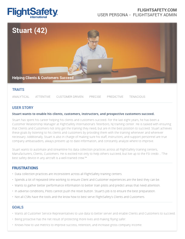
Educating management and internal teams the importance of building a mobile focused, responsive website for any platform and device was our first major milestone. I broke this milestone into several smaller tasks for myself and my team to work upon. Defining User Personas and Stories based upon our User Interviews, UX Research, and Data Analysis allowed me to focus our team.


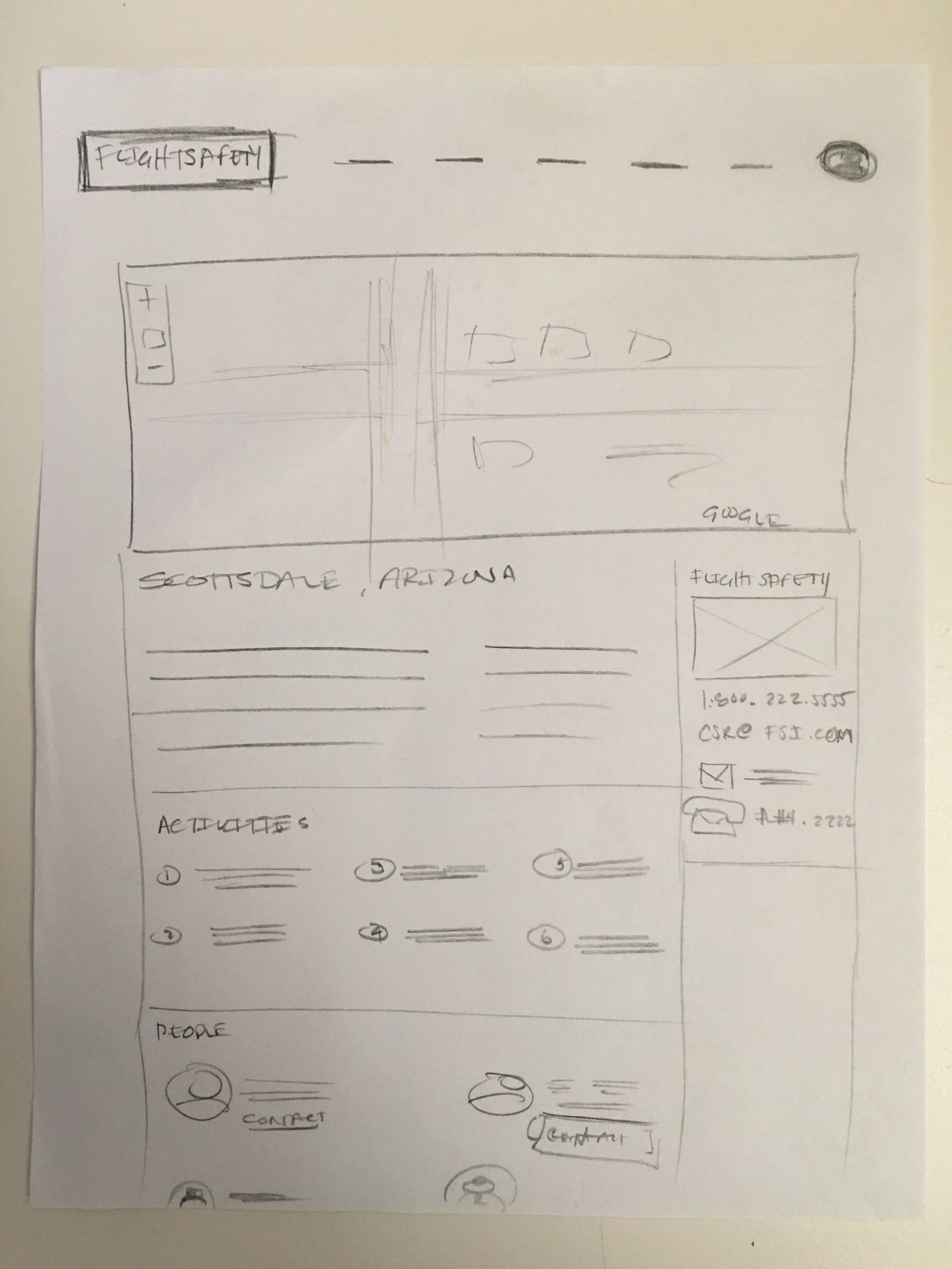
We continued our UX work by creating Moodboards & Sitemaps, running Brainstorming & Card Sorting sessions, drawing out Flow Diagrams, sketching Storyboards, and making Paper Prototypes to facilitate our reorganization of content into logical sections and creating clearly defined pathways for users to traverse.


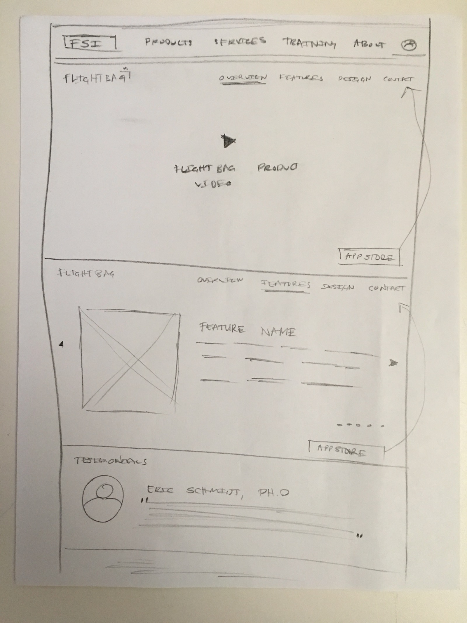
As the existing content was mapped out into better defined categories, I was able to start sketching clearer designs and Wireframes of what our website could potentially look and function. I created four layout responsive Wireframe versions, which I later converted into High Fidelity Mockups and shared with the team via InVision. For clarity, mobile mockups of the new website were also created to showcase how the layout and content could be reorganized within a mobile browser. Our teams at FlightSafety were largely remote, so sharing these mockups asynchronously with stakeholders early within the process helped myself and my team to iterate and improve out designs.


WORDPRESS DEVELOPMENT
Concurrently whilst our design processes were running, I recommended team that our new website using WordPress. Having built many websites for smaller clients and customers with WordPress, I was confident that our internal users could become self sufficient with website maintenance. I selected WordPress because our internal teammates would be able to quickly learn how to create, edit, and deploy content and images.
To help secure backing and internal buy in, I presented case studies to our Engineering, QA, and Product Management teams. To build their confidence and facilitate understanding, I created four prototype WordPress websites based upon the mockups. These responsive prototype websites allowed them to go beyond Mockups on InVision and view the sites on their desktop, tablet, and mobile browsers. Signing into the WordPress Dashboard allowed them to build familiarity with how content and images would be created, uploaded, edited, and deployed. From a user management and site design perspective, I was able to show in detail how WP Themes, Pages, Posts, Images, HTML, CSS, and the MySQL Database comprised each website. Responsive wireframes, mockups, and a prototype were also built for mobile browsers.


EXECUTIVE ENGAGEMENT
After formalizing our UX Research, I summarized our recommendations, prototypes, and materials within a formal presentation pitched to the executive team. As the website had last been overhauled in 2002/2003, it was imperative to provide a proposed timeline, project roadmap, tasks breakdown, and cost of the website redesign undertaking. For massive size of FlightSafety, this was not a small project that would require a few months time from a few people. Given that my UXD team was so small, it was important to me to succeed in proving the validity of the redesign and for our direct involvement and leadership. As a direct result of the work and presentation of my team and I, we secured approval of the website redesign.
FlightSafety has had a long relationship with Greteman Group, an aviation design focused marketing and communications agency. Over the past twenty plus years, GG had worked with FlightSafety to build print and online campaigns, documents and materials, branding, and website updates. Once the redesign project was approved, we collaborated with their design and development teams to design, build, gather feedback, iterate, test, and ultimately deploy the new FlightSafety.com website. Greteman was responsible for creating a new site prototype. They would develop the basic site once it passed milestones, reviews, feedback, and design and development iterations. The FSI Product team would be responsible for building out other features and workflows as necessary.
WPENGINE.COM
My next major milestone was to locate and get approval to partner with a hosting company that specialized in hosting enterprise level WordPress websites. Scaling an optimized WordPress website that need to be load balanced and could quickly scale up automatically based upon web traffic was not something our internal engineering team could presently could do.
To assuage FlightSafety’s engineering’s team’s queries and concerns about managing WordPress and load balancing servers, I extensively researched hosting companies and their product offerings. I selected WPEngine.com to host and manage the new FlightSafety.com website and servers because of their services, attentiveness, load balancing, and scaling abilities. I set up our account, and worked with technical sales rep, and then helped to train our team to deploy our setup, workflow, and web instances. WPEngine’s focus upon solely hosting WordPress based websites gave our internal teams the confidence that they could help us successfully host, build, deploy, and manage our new websites.

We later pulled hosting of our website internal to our own, self-managed data center and servers. Based upon our workflow process and integration with Microsoft TFS, our Engineering team were able to bring everything in house. This enabled us as a team to have greater management abilities over our site, but also to ensure that our data was protected. The Engineering team had quickly ramped up their WordPress skills and our migration was seamless.

WordPress Workflow Diagrams
DEVELOPMENT & ITERATION
As the formal design and development processes kicked off, a great number of people and teams contributed to the redesign process. My role now shifted to collaborate with the GG design team as we worked through formal designs, defining a Style Guide, and taking inventory on every other online touchpoint that would require UI/UX updates. Additionally, I was also tasked with preparing other internal teams for the eventual site transition. Our executive team and internal teammates who would eventually manage site content, requested a Multi Site setup. Essentially this meant there would be three separate WordPress sites contained within a master WP site. Along with mapping out content and development workflow, producing documentation, reviewing development progress, and running WordPress training sessions, I now began to focus attention upon other tasks.
COURSE SEARCH
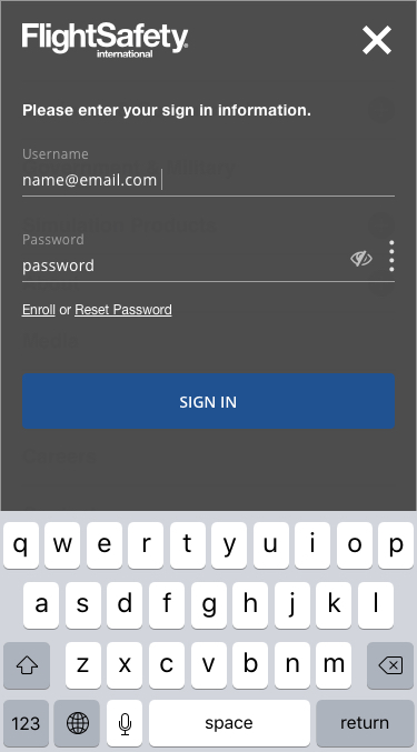
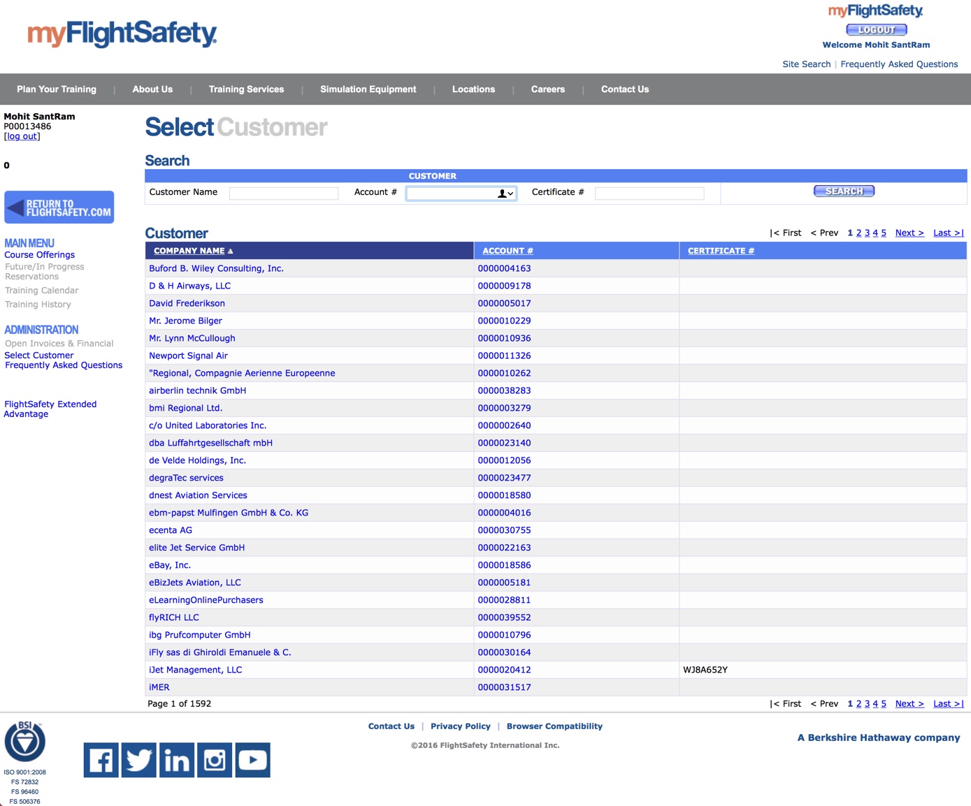
One of the biggest pain points our users had was being unable to easily search for upcoming courses and availability at an of FlightSafety’s 55+ Learning Centers. Typically FlightSafety Clients and Customers would search for courses and availability by signing into myFlightSafety.com. Users would then have to navigate to find specific course based upon the aircraft and model. Alternatively they could find out what courses were available at each Learning Center, though they invariably would call their designated Customer Support Representative (CSR) to find availability for specific courses and to make reservations.


FlightSafety does a wonderful job of focusing upon the customer in all of their Learning Centers. However online, the process was confusing and unintuitive for most users. While correcting this workflow had been done in bit and pieces, the solution was far from usable, much less elegant. Interviewing users as well as CSRs provided valuable insights on how to solve the problem. As with every other aspect of this website redesign, I researched other reservation engines. Synthesizing my research and analysis, I drew paper prototypes with which to solicit feedback from CSRs and the Engineering team. Iteration upon my designs led to formalized Wireframes, and then accepted Mockups.
COURSE SEARCH ON OUR FORMER WEBSITE 2003-2018
Course Search has been relegated to live behind the myFlightSafety portal. There was much work to be done to design the reservation system that worked within our new Website Design System as well as with our existing databases.

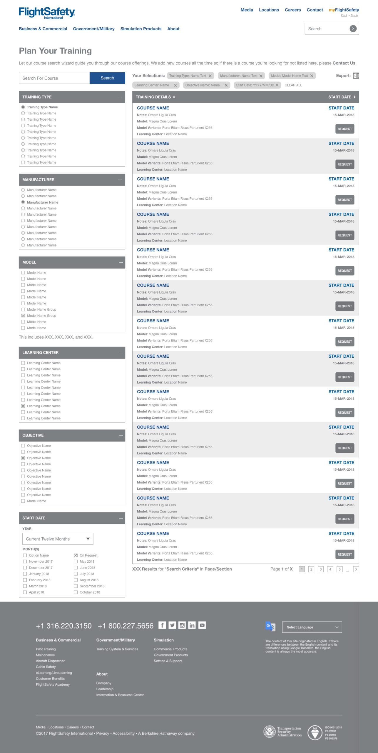
COURSE SEARCH – NEW WEBSITE
2018 – PRESENT
I designed the Course Search to work simply while processing course schedules, user records, and availability from our 55 Worldwide Learning Centers.
CAREERS INTEGRATION
I was charged with integrating SAP SuccessFactors as our new jobs board engine in advance of our new website being launched. I collaborated with teammates from Human Resources, Product, and Management to outline our goals, roadmap, and integration strategy. While the backend of SuccessFactors integrated well with our existing tech stack, the functionality of the SuccessFactors platform was constrained. Customizing the User Interface to follow our new Style Guide and emerging Design Patterns was simply not possible. I presented several solutions to help solve this issue, one of which would be to create a custom front end that mirrored our new website design. However, due to resource constraints, we opted to go with an interim design and wait for SAP to release a more customizable update to SuccessFactors.


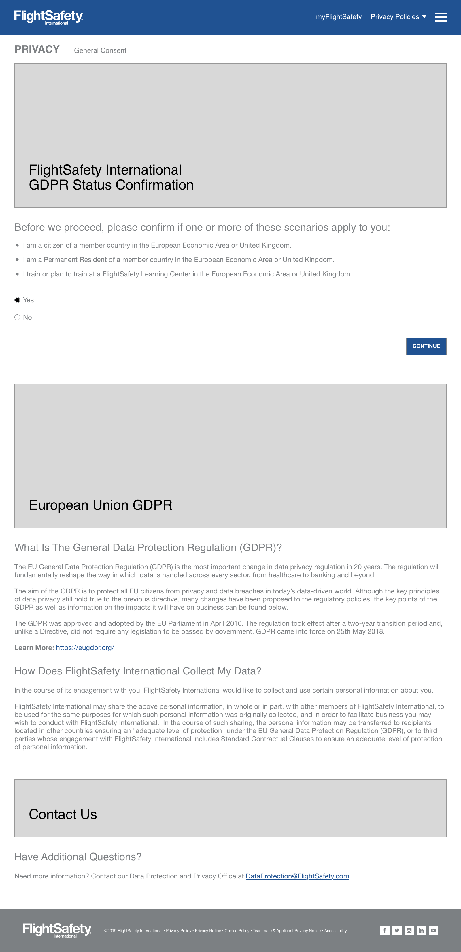
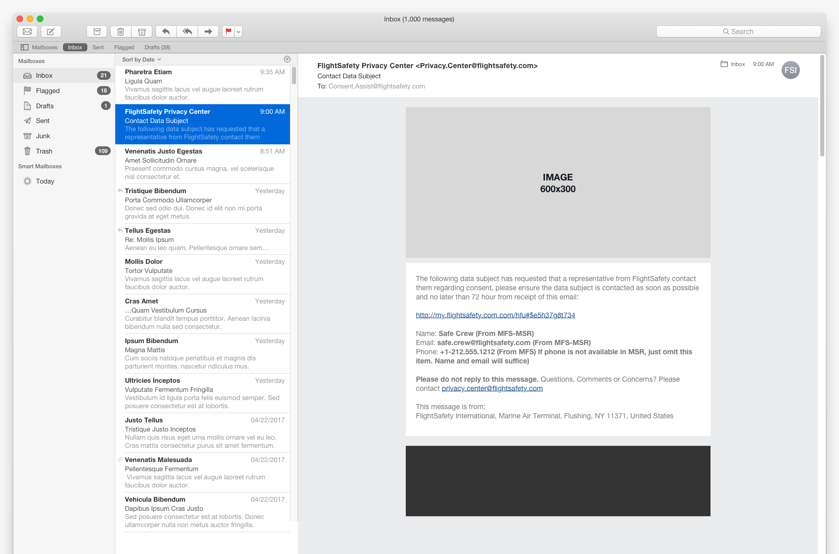
PRIVACY CENTER/GDPR
Due to changes within privacy laws within the European Union and General Data Protection Regulation, we had to follow and comply with directives to be transparent to users with how we collected user data, how it was used, stored, and protected. Most importantly, we needed to present users with a clear opt in/opt out workflow to provide consent for data collection and usage. I researched the GDPR requirements along with investigating forward thinking companies who were not only GDPR compliant, but had built robust Privacy microsites where users could learn a great deal more about their rights, data, and usage. Along with working out the user flow for GDPR compliance, I prototyped a FlightSafety Privacy Center microsite, which was waiting for approval.


OUTCOME
Fourteen months after we began the project, we relaunched FlightSafety.com complete with many of aforementioned additions and updates. Over the course of the website redesign project, I had collected a plethora of information which was documented for the team. When I joined FlightSafety there were at least four Style Guides in use. Working to synthesize these down into one coherent and useful Style Guide was significantly helped with the website redesign. From this foundation which we built, I was able to assist the eLearning team begin the process of redesigning eLearning.FlightSafety.com. I also worked upon a Design System to set standards for all internal and external websites, applications, and documentation.
As to be expected, there were many other areas, pages, and workflows of our new website which required well thought out and designed UX solutions to be developed.


LEARNINGS & FAILINGS
While we were all collectively proud of the work we completed with the redesign, we failed in many ways which helped the team and myself grow. Several of the delays were avoidable, as collaboration could have been better between teams and individuals. Our back end databases and code bases for many applications were connected through confusing APIs and processes, many which needed to be rebuilt. As FlightSafety was growing the internal Product and Engineering teams, there was bound to be work to clean up legacy applications and processes, as well as building internal teams. Earning trust takes time, and through the work of the collective team, we built a website that raised our commitment to the user and ourselves.
SUCCESSES
We measured our successes by monitoring our website analytics and traffic, speaking with users who were delighted with the redesign, watching the numbers of online reservations spike as the number of calls to CSRs for assistance dropped. We were commended as a team and individually from the executive team as our work impacted so many positively. Even though we hit delays and some setbacks, the company, teams, and teammates learned a great deal from the process.
FlightSafety.com 2018 – Present
WORK SAMPLES
1. FlightSafety.com Redesign Pitch
2. FlightSafety.com Technical Audit
3. FlightSafety.com Mobile Optimization
Please Note: These work samples are not for distribution.